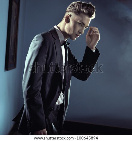
I am in the middle of redesigning THE NIGHTLIFE SERIES cover art. The series will eventually have 8 or 9 novels (5 right now). This process has consumed hours and hours, scanning through endless pages of shutterstock images. For several weeks I have tortured my friends and critique partners with piles of lightbox images.
They need a break. And I need fresh eyeballs and opinions.
So, if you have read any one or more of the Nightlife Series novels, or even if you have not, give me your opinion.
Short bio on Aaron:
22, thin, he has dark hair and eyes, pale skin. He's not overly tall, not a musclebound freak, not your typical 'alpha male' on the cover of a romance novel. He is wicked fast, lethal when angry, and cuts through people like a hot
knife through butter. He is underestimated by virtually everyone.
A bit surly at times, he can be a real smartass, sarcastic, and of course, he's a bloodsucking vampire. Bathed in the 'magnetisme animal' of a vampire, women cannot stay away from him, which he takes advantage of. He collects female admirers effortlessly, with a single look.
Aaron dresses sharp, his master Michelle doesn't allow him to look like a bum. Having impeccable fashion sense, Michelle shops for him. And yes, he does have a master, and is not truly a free man, but that doesn't slow him down much when he gets going.
So, without further ceremony, here are the choices I have narrowed down:
#1 Smartass Aaron


#2 Suave Aaron


#3 Slick/Dangerous Aaron


All comments are appreciated. LADIES, LEND ME YOUR EYES AND YOUR GUT REACTIONS.
:)

#2 Suave Aaron ... Yummo!
ReplyDeleteYou think so? My daughter likes #3, Slick/Dangerous. I like all three for different reasons.
DeleteThanks for the vote!
Travis,
ReplyDelete#2 all the way!!! He's suave and masculine!
#1 has better eyebrows than me, which make me jealous and leaves me feeling slightly competitive! Not masculine enough and Aaron didn't strike me as the waxing sort of fella.
#3 Slick dangerous Aaron isn't bad either, but number 2 is the winner in my book!
Hope it helps,
E
Yes, very helpful!
DeleteThanks.
From what you described I'll go with
ReplyDelete3. Slick/Dangerous Aaron - this is the closest to how I pictured him.
1. Smart ass Aaron
before
2. Suave Aaron. (I don't see him as suave at all, although he picked it up later as a vamp)
I am inclined to agree with you. But then I like all three versions.
DeleteMy only issue with #2 was that he felt a little bit older to me, maybe not quite young enough.
Thanks for chiming in. :)
Suave Aaron. He caught my attention immediately and fit the description well.
ReplyDeletePatti Duplantis
My gut reaction is that I like #2 the best out of all the images. But having read the first book so far, I think #2 is a bit older than I pictured Aaron.
ReplyDeleteSo I'd have to say: 3,1, 2 - but for #1 I only like the first image (there's something off about the angle in the second image on #1 for me)
#2 all the way. #1 is not appealing at all - I can't really see #3 closely enough to see he face; he's nice looking, but #2 can also pull off the dangerous look, the suave, sexy look, and the cocky, smartass look.
ReplyDeleteI like 3, 2, 1, in that order. 1 is too young, 2 is too old and 3 is just right!
ReplyDeletePersonally, I like 2 the best but if he's a bit too old then I think 3. I think it is important to have the face of a vampire hold a bit of sexy danger otherwise the whole mystique and allure of it just kind of falls apart.
ReplyDeleteI prefer #2 Suave Aaron.
ReplyDeleteAnd from a design POV the photos would be easier to incorporate into a cover design. It's crisp and stands out, without being too busy and gives you plenty of room to add text.
Suave #2 pic - closer up - is my preference. All are hot but I like that one the best.
ReplyDeleteFYI I found it VERY DIFFICULT to read the words on your site with the background. The red writing & the writing on the girl in the background are readable but otherwise I found the blue/skyline background obscured the black printing. I can't really see the other comments so I don't know if anyone else has mentioned this.
Definitely #2 Suave Aaron is my choice. His dangerous ability is hidden behind a very pleasing exterior. But he doesn't strike me as thin enough or pale enough. That's why I think #3 Slick Aaron fits your description better. But #3 is a bit too sharp and he's not my type and I don't find him as attractive as #2.
ReplyDeleteThis comment has been removed by a blog administrator.
ReplyDelete